Emily Colgan
INFO 2201
December 2, 2022
Final Project Writeup
For my final project, I ultimately decided to work with book data. I started out in my project plan using crime data and more specifically serial crimes. Once I began working with this data, it became increasingly obvious that I was not going to get the results that I wanted. I even was warned when I turned in my project plan and it turned out to be extremely difficult to work with the crime data. In the name of self preservation I decided to scrap the crime data and find other sources so that I could complete the project fully. I believe that this was the right decision and I am happy with the results that I achieved with my book data.
When looking at the book data I collected, I immediately started thinking about the New York Times Best Sellers lists and whether it was an accurate judge of a book. Some of the other data I collected was from a site called Goodreads which is one of the largest sites for book readers to rate, review, share, and find books. With this data I could see if books that were on the New York Times Best Sellers lists were actually well received by the community at large. I also gathered data from Amazon’s best-selling books. I could do the same analysis as the Goodreads book as the Amazon books and also see what books people were actually buying for themselves, even if they weren’t necessarily the “best” books. I then wanted to see if the genre of books had any impact on its popularity and rating. Not all datasets that I found about books included their genres so I had to go hunting for the right dataset.
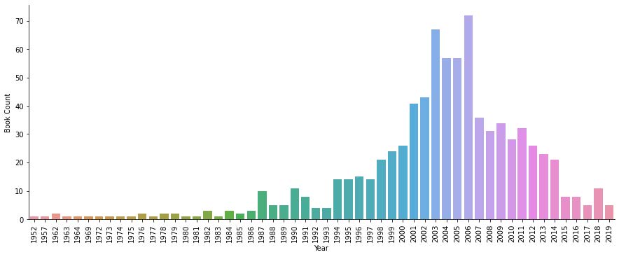
In order to answer these questions I first had to go through and explore and clean my data. I started with the New York Times Books API. It isn’t a very large API so I was able to parse through it fairly quickly. I then had to go through my three CSV files and clean them up so that I only had the data that I needed and wanted to analyze. First, I looked at a group of books that had over 800 observations that date back to 1952. What I did first for this dataset was look at how many books were published each year. I know that this dataset is not comprehensive so I can’t make any bold statements about what this graph showed but it seemed like there was a publishing boom in 2003 and 2006.
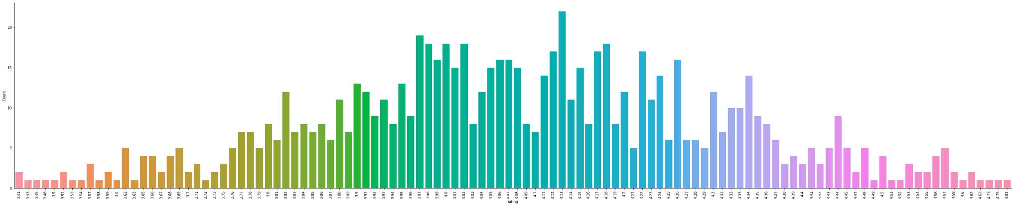
I then added a column to the dataframe so that I could count each book and sum them together by what rating they received.
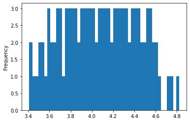
Then I was curious what a histogram of the ratings would look like. It didn’t end up looking like I expected it to, which was interesting. I think it’s because the histogram doesn’t include the full range of rating possibilities, and the bar graph has the ratings divided into very small groups.
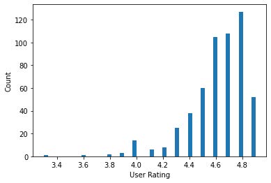
The next dataset I looked at was Amazon’s bestseller list from 2009-2019. I first wanted to look at the reviews that these books received and compare them to the last dataset.
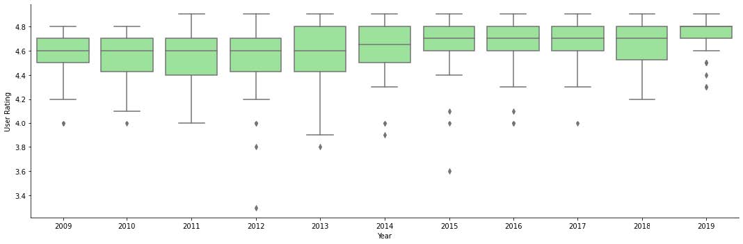
Then I was curious how ratings changed over time and between genres. First I looked at the distribution of ratings over the years using a boxplot. Obviously the ratings are all going to be high because this data is from the best sellers list.
This dataset only classified books as either Fiction or Nonfiction so I looked at the distribution of ratings between the two genres.
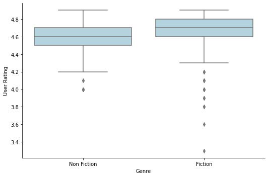
This graph is showing that overall fiction was on average rated higher than non fiction but there were more negative outlier reviews for fiction than non fiction. I think this is probably because there were many books on the Amazon best sellers list that I would consider “fun” instead of fiction. For example there were many cases of adult coloring books on the bestseller list, which I think is very cool to look at because it really shows that what’s considered the “best” by someone like the New York Times actually varies with what a lot of people are actually buying and reading. After that I wanted to look at what genres were on the Amazon best seller list more in what years.
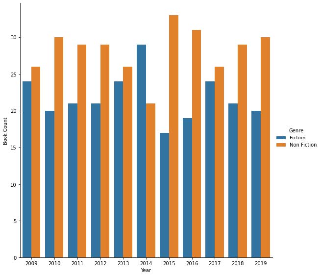
Based on this bar chart, in most years non fiction showed up more than fiction, except for 2014. I found this particularly interesting because when I looked at the ratings for each genre, fiction had, on average, higher ratings than non fiction.
After the Amazon dataset, I started using a dataframe that also pulled its data from Goodreads. This data set had around 5000 observations and I used it primarily because it had good data on genres. First I had to get the genre categories down to its primary genre. Once I did that I decided to group the data by its genres and then see how many books were in each genre. I then did the same thing but grouped by what rating the book received. I didn’t realize until after making the graphs that it was way too much data. Because I had 5000 observations, there were way too many different genres. I then decided that I needed to filter the data to only show the most popular genres.
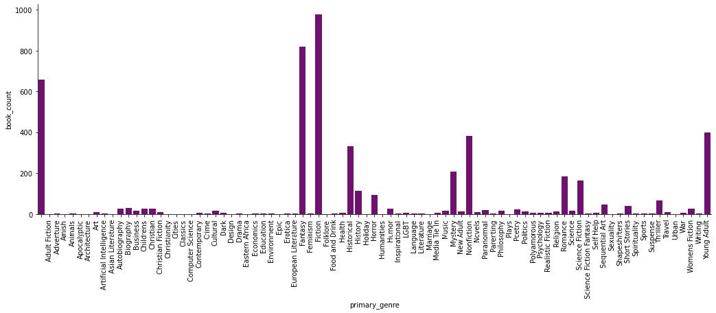
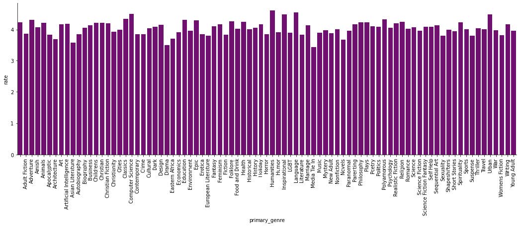
Once I sorted out the data I ran the same graphs and got some easier visualizations to look at and decipher.
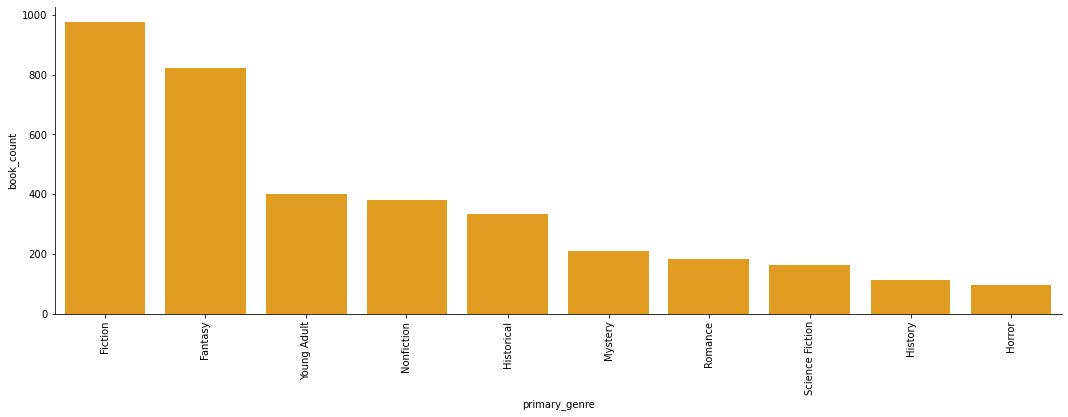
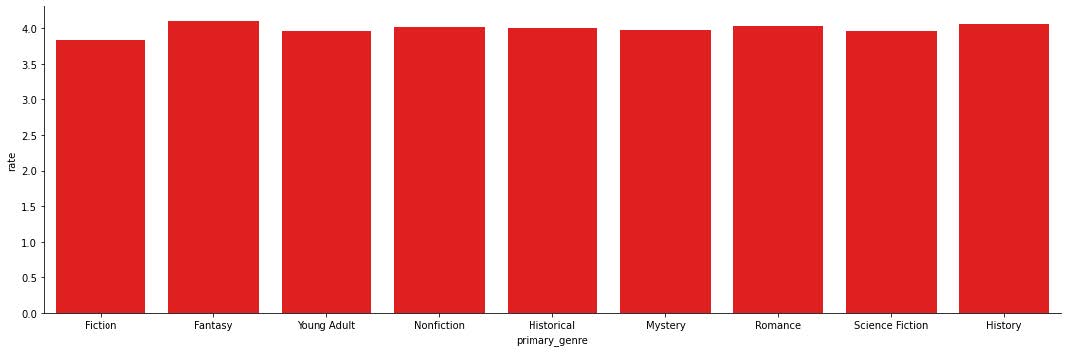
It makes sense that the top genres would be fiction, fantasy, and young adult, but I do find it interesting that nonfiction is below those three. With the ratings graph, I’m not surprised that most of the genres have pretty high ratings on average but I am surprised that none of the genres have average ratings much higher than a 4. Then I wanted to do something similar as I did with the previous datasets and look at the distribution of ratings for the top ten genres.
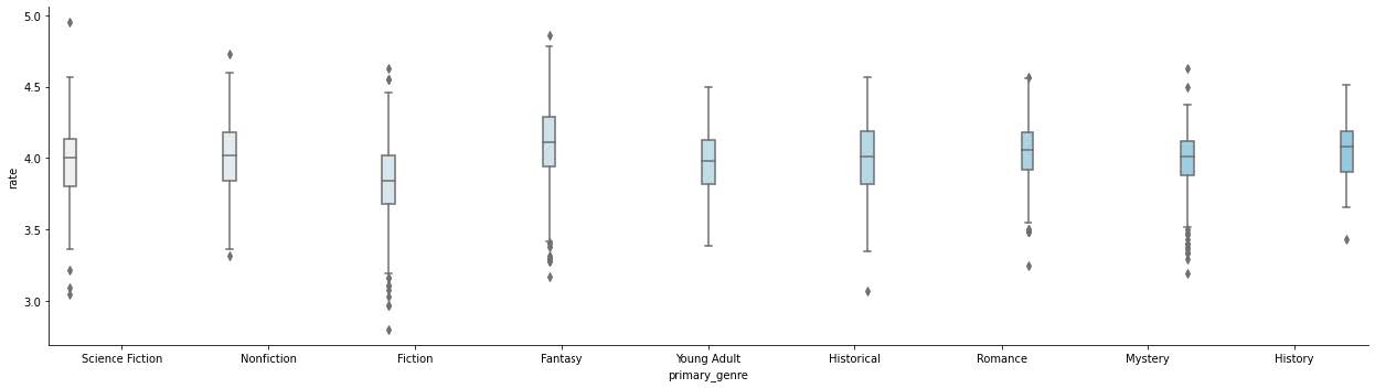
Looking at this boxplot reveals a lot more than the last two do. Now it makes more sense that the average ratings for genres were so low. Even the highest ratings in the dataset were considered outliers for their genre. It also shows some lower outliers but none of the top ten genres had any reviews lower than roughly a 2.5. Finally, I tried to use the list of Amazon bestsellers and run it through the New York Times API to see what books from Amazon showed up on the New York Times Best Sellers list. What I wasn’t expecting was to only get 4 books back. I can’t really do a whole lot with only four books so I decided to use a different data set to analyze. I sent my first dataset through the same function and through the API and I ended up with a dictionary that had the name of the book and the most amount of weeks it spent on the New York Times bestseller list. I then sorted the dictionary to show the top 13 books who spent the most time on the bestseller list and put them on a bar graph to compare.
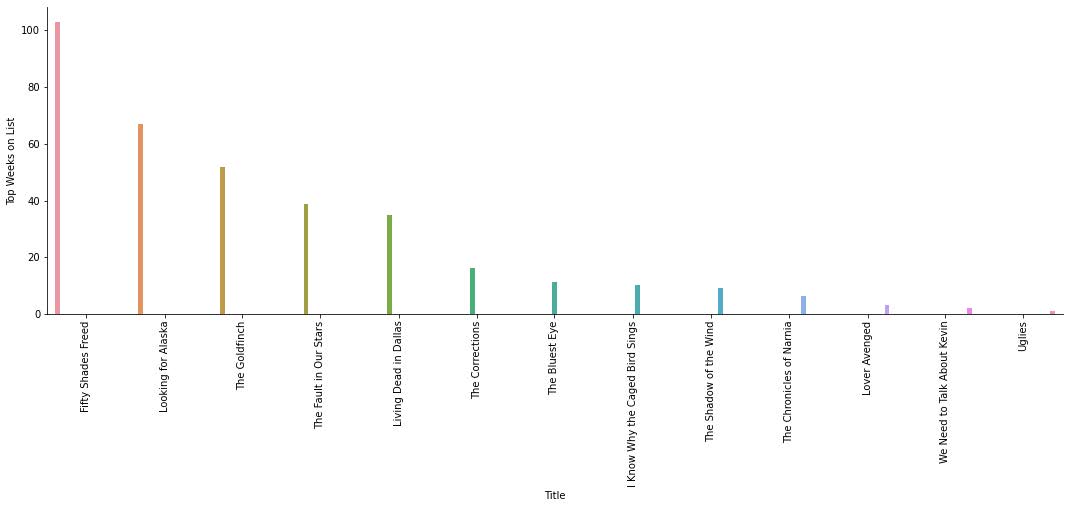
I think that it’s pretty funny that Fifty Shades Freed spent the longest amount of time on the New York Times bestseller list. This also is not a comprehensive list and I’m sure there are other books that spent more or similar amounts of time as these books.
Overall, the results that I found were very similar to what I was expecting. I’m a little upset that my project plan isn’t about these datasets because I would’ve liked to see how my questions changed over the course of this project. If I had unlimited time and resources I think I would’ve looked more into comparing what books showed up on the New York Times Best Sellers list because that analysis took quite a bit of time to code and to run. I’d also be interested in what’s not popular and what kinds of books don’t get bought.