Introduction
The purpose of this paper is to answer the question: Which geographic areas of the United States have both high levels of social vulnerability and historically high levels of declared emergencies? The answer to this question will identify areas that have ill-equipped populations or governance that are also prone to presidentially declared disaster emergencies. The expectation is that by identifying these areas, mitigating actions can be taken to reduce the risk of future death and damage.
One of the predominant drivers of disasters is climate change. According to the United States Geological Survey (USGS) climate change is causing an increase in global surface temperatures. This is turn will mean more droughts, storms, hurricanes, landslides, floods, and wildfires. In addition to natural disasters, climate change will increase damage to infrastructure resulting in more occurrences of power outages, increased energy costs, and strain on the transportation networks. Not least of all, climate change will affect adversely communities across the board, with vulnerable communities being affected disproportionately in terms of prosperity, economic equality, and access to quality and timely healthcare (U.S. Global Change Research Program, 2017).
Methods
Two sets of data were used primarily for the geospatial analysis. The first is the Historical Disaster Declarations from the Federal Emergency Management Agency (FEMA) for the years ranging 1964 to 2011, and the second is the Centers for Disease Control and Prevention (CDC) / Agency for Toxic Substances and Disease Registry (ATSDR) / Geospatial Research, Analysis, and Services Program (GRASP) 2018 SocialVulnerability Index (SVI). This data was used to perform a geospatial analysis covering the United States by county.
Beginning with the Historical Disaster Declarations, this data reflects the Robert T. Stafford Disaster Relief and Emergency Assistance Act (Stafford Act - 42 U.S.C. 5721 et seq.) which permits the president to declare a disaster an “emergency” or “major disaster” depending on if the declaration is before or after a major catastrophe. These declared disasters are derived from Preliminary Damage Assessments which are used to determine if the disaster damage exceeds the resources and ability of the state/tribal government, which in turn formally requests Federal assistance. Depending on the nature of the disaster, the Federal government may offer some combination of Individual Assistance (crisis counseling, unemployment assistance, etc.), Public Assistance (debris removal, bridge and road repair, etc.), and Hazard Mitigation Assistance (FEMA 2022). This data counts the number of presidentially declared disasters by county for the time period, ranging from zero to 29.
The SVI data measures social vulnerability for communities based around counties for the year 2018. This largely measures a community’s need for support before, during, and after a disaster. Vulnerability is measured along 16 factors organized into four themes: Socioeconomic Status, Household Compensation & Disability, Minority Status & Language, and Housing Type & Transportation. The SVI is designed to be used by public health officials to create resilient communities where it is needed. Highly vulnerable counties are defined as those “at the 90th percentile of values” and given a “flag” count corresponding to the number of factors at this level (CDC, 2020). County flag values range from zero to 11 and this is the data that was used for analysis in this project.
Before the actual analysis was performed, an appropriate projection had to be selected. Both sets of data came in a Mercator projection, which in modern times serves no real purpose to the average geospatial practitioner, even as a global projection. For visual aesthetic and minimal shape distortion I selected the North America Albers Equal Area Conic projection, projecting the Declarations and SVI layers as I added them as well as my county-based United States geography layer.
Next, I explored the Declarations and SVI data layers, noting which fields were going to be most appropriate for the analysis and using graduated colors to represent the appropriate fields I wanted to use. This gave me a feel for what I’d be working with. It was at this point also that I started thinking about how I’d classify the data. My original intention was to convert the layers into raster format and then perform raster math to further analyze, but this proved unwieldy due to either processing time or a severe amount of pixel artifacts in odd areas.
So, my next step was to create a new layer for both the SVI and Declarations layers by selecting the relevant attributes. Regarding the SVI layer, I used the total “flags” count, retaining all flags from counts “two” and higher. In retrospect, it would have been better to keep all flag counts starting at “one”, but this did not have an adverse effect on the outcome of the results. The SVI was classified into three tiers largely following the Jenks classification methods with some adjustments. Regarding the Declarations layer, I created a new layer retaining all counties that had a count of 15 or more presidentially declared disasters. These are counties that reflect at least the median number of declarations.
To combine the two layers, I selected all SVI counties by their flag count and then selected a subset of this selection where it overlaps with the Declarations layer. The resulting single layer thus encompassed the three-tiered SVI information for all counties with 15 or more historical declarations. This process was repeated three more times, each time for each one of the tiers of SVI. The purpose here was strictly for the ability to process statistics of the underlying data as it pertains to each tier of the SVI layer. With the resulting individual layers, the data table was exported as a .csv file, converted into an excel file, and sum totals ran for the affected population size in each state and county according to the level of vulnerability of the layer.
For visual readability of the maps, I used both a state and county layer underneath the SVI/Declarations layer(s). Although the state-based map was on a slightly different scale than the rest of the data, which was all based on the same county-based map, at the scale of viewability it worked well enough in marking the state borders. The legends are minimalist with only the most pertinent information, and there was no need for a North arrow or scale bar since everyone knows which was North on a map of the United States and roughly the size of the United States as well.
Results & Conclusion
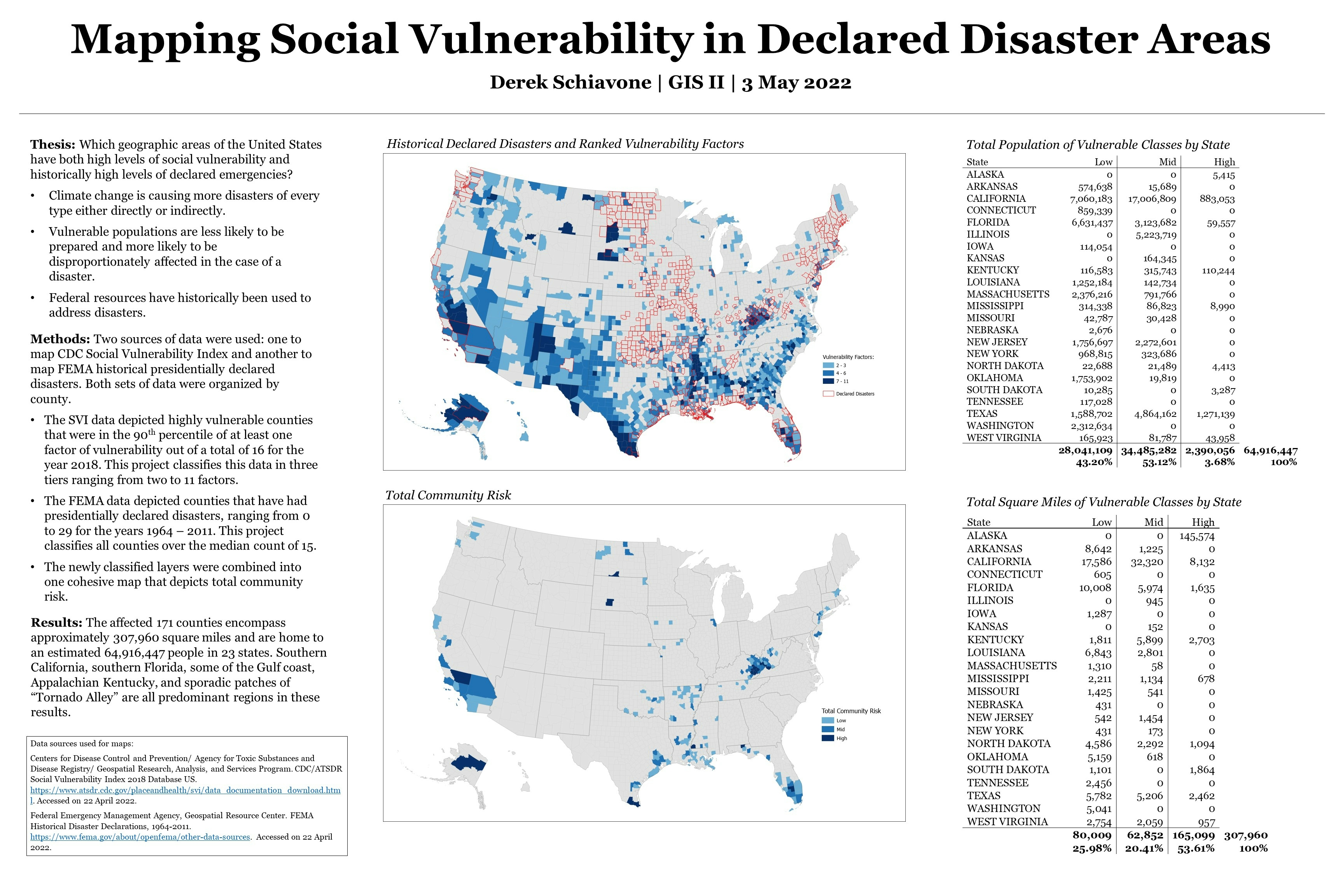
Two maps were created for this project. The first map (see Figure 1) depicts all counties with 15 or more presidentially declared disasters in a red outline. It also depicts all counties that are “at the 90th percentile of values” for counts of two or more factors of vulnerability, structured into three tiers. The choice of blue color versus red is indicative of the fact that being vulnerable, although meaning the increased risk of disaster, does not connotate an inherently “bad” value judgment.
This is a busy map but is useful in that it gives a high-level overview of both sets of data in a single glance. A trend of our classified vulnerability can be seen along most of the coastlines of the United States and the US-Mexican border, especially affecting nearly all of Alaska and the South and South-West regions. Other notable areas include Appalachian Kentucky and some of the Dakotas. Trends in the classified historical presidentially declared disasters can also be seen in the Gulf states, New England, central Appalachia, and “Tornado Alley” running largely from Oklahoma up to North Dakota, the eastern coast of the north-eastern Pacific states, and southern California.
The second map (see Figure 2) is the result of taking the overlapping data of the SVI and Declarations layers, only showing the relevant “vulnerable” counties that fit the historical declarations criteria, forming a three-tiered risk classification. This is a more streamlined map with far fewer counties but there are still some trends that can be seen. Southern California, southern Florida, some of the Gulf coast, Appalachian Kentucky, and sporadic patches of “Tornado Alley” all stand predominant in this depiction.
In total, the affected 171 counties encompass approximately 307,960 square miles and are home to an estimated 63,337,847 people in 23 states. Of the total vulnerable population, 42% reside within the Low-risk tier, 54% reside within the Mid-risk tier, and 4% reside within the High-risk tier (see Table 1). Of the total geographic area covered, 26% is considered Low-risk, 20% is considered Mid-risk, and 54% is considered High-risk, though this is largely swayed by Yukon County in Alaska which alone comprises 147,574 square miles (see Table 2).
The counties identified in this research have been identified because they are home to highly vulnerable populations that are also known areas of frequently declared disasters. But by identifying these counties the hope is that those who are in positions of authority can enact changes proactively to ensure the protection of life and property.
References
Centers for Disease Control. (2020, January 31). CDC SVI 2018 Documentation. Retrieved from Agency for Toxic Substances and Disease Registry: https://svi.cdc.gov/Documents/Data/2018_SVI_Data/SVI2018Documentation.pdf
Federal Emergency Management Agency. (2022, Janurary 4). How a Disaster Gets Declared. Retrieved from FEMA.gov: https://www.fema.gov/disaster/how-declared#:~:text=The%20President%20can%20declare%20a,that%20the%20President%20determines%20has
U.S. Global Change Research Program. (2017). FOURTH NATIONAL CLIMATE ASSESSMENT, Volume II: Impacts, Risks, and Adaptation in the United States. Retrieved from Global Change: https://nca2018.globalchange.gov/
United States Geological Survey. (2022, April 25). What are the long-term effects of climate change? Retrieved from United States Geological Survey: usgs.gov