"One thing I love doing when it comes to map making is surfing the internet for some beautiful maps. While doing that few months ago, I saw some maps that have a fading background for their titles. I find these maps very interesting. From these maps, I could identify two benefits of using a fading background for a map title, which are:
1. Enhanced Readability: Fading backgrounds can make text or important elements stand out from the background, making them easier to read and understand.
2. Improved Aesthetics: Fading backgrounds can enhance the overall look and feel of a design, giving it a polished and modern appearance.
These two benefits are what I always consider when making maps.
Now, let go into the main subject matter. How can we add fading background for map titleCheck the step by step guide below.
HAPPY MAPPING!!!
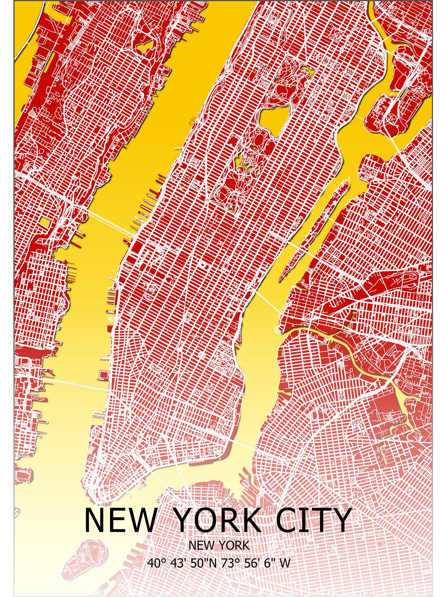
STEP 1: The map below is map of New York City which shows no fading background for the map title and this makes the title difficult to read.
Here is a brief explanation of how to create the map: Download road and boundary shapefiles using QuickOSM Plugin or Geofabrik and assign specific colors to the roads and boundaries in the symbology tab of each respective shapefile.

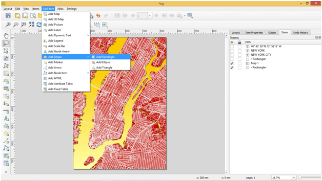


Note: When using a white or lighter colour for title, black or darker fading colour should be used as background. When using black colour or darker colour for title, white or lighter fading colour should be used as background. Understanding the concept of Color combination is very important.

Don't Hesitate to send me a message if you have an inquiry.