As we continue to advance in our understanding of the world and harness the power of geospatial technologies, maps will remain an invaluable tool. Maps are a great way to tell stories; the end result of transforming spatial data into meaningful patterns for the audience to learn about something happening in the world around us.
One crucial role of geospatial analysts is to accurately and clearly visualize complex spatial data. However, a surprisingly common mistake made by beginner geospatial analysts when creating maps using graduated colors, like with a choropleth map, is to neglect normalization.
It is very easy to create maps that communicate patterns that are very inaccurate since mapping tools only give us freedom in how we portray data and not so much in how we understand what we are trying to communicate or how the audience will interpret it. It, therefore, becomes our responsibility to ensure that the maps we create accurately reflect patterns in data in an effective way.
Normalization
One common pitfall analysts encounter when exploring patterns in data is comparing quantities without considering their unequal basis. When trying to make a comparison of raw quantities, such as population, disease outbreaks, or crime rates, it is important to recognize that each quantity may represent areas of different sizes or populations.
For example, mapping the total number of facilities or events between cities with different populations without adjusting the data to account for the differences in population or sometimes in the size of the area would yield limited meaningful insight — this makes little sense. When the population or area varies substantially the problem of estimating quantities proportionately is non-negotiable as it provides the only way to make any sensible interpretation of the information.
Normalization describes a way to adjust data proportionately in order to make meaningful comparisons. Without normalizing data, especially when creating choropleth maps, the map becomes totally useless and does not provide any accurate means to visually make comparisons across different regions.
A normalized map is interesting and more useful because it reveals something unique.
Choropleth maps
Choropleth maps are one of the common geospatial visualizations that provide a powerful and effective way of characterizing spatial patterns. By using different colors or shades, choropleth maps convey data values across geographic areas, such as countries or states. The varying intensity of colors serves as a visual indicator of the magnitude or density of a particular variable, allowing for a solid visual representation.
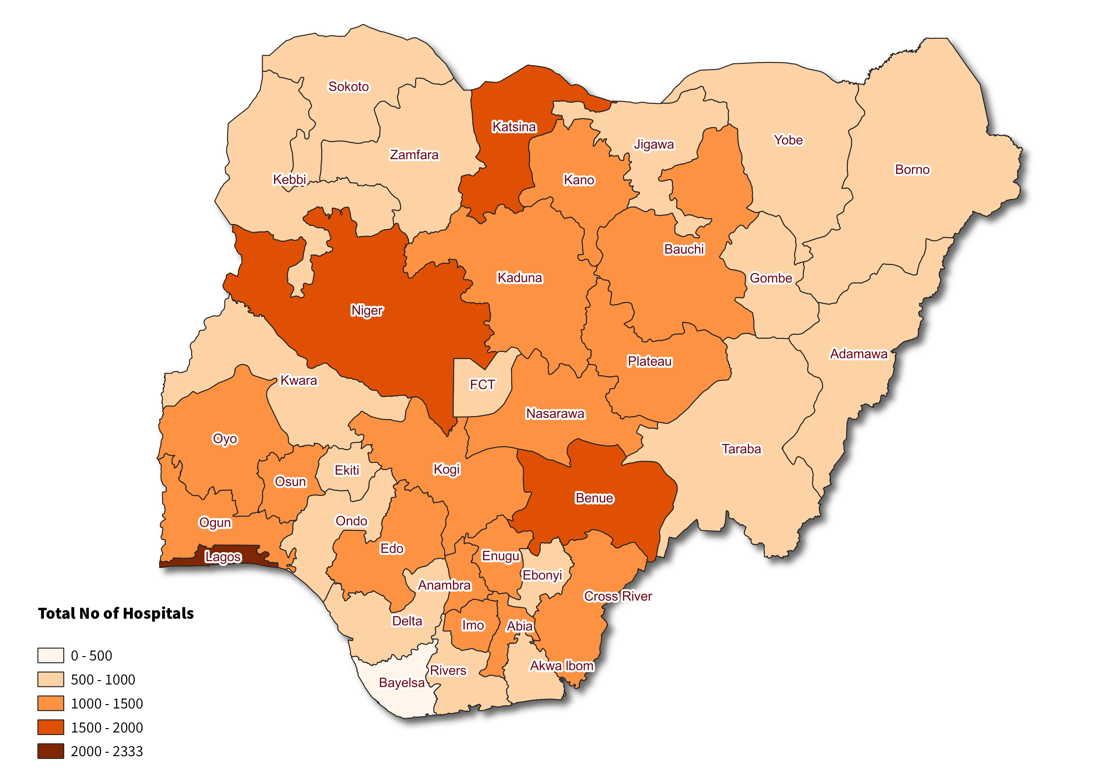
Check out what happens when creating a choropleth map without data normalization vs with normalization as shown in Figures 1 and 2.
The two maps below use colors to depict the number of hospitals by state in Nigeria, revealing two different spatial patterns.
The map in Figure 1 shows the total number of hospitals, with Lagos having the largest number. Given that this map represents these areas based on total raw value, we are comparing them on unequal terms. It is then reasonable to expect the most populous state, Lagos, to have a higher number of hospitals.
Find a version of the map that has been normalized below. While there is some variation in the area for each state, the biggest variation is in the population across each state.
This map shows the proportion of hospitals to the overall population in each state (in thousands) i.e. hospitals normalized by population. This gives a rate, rather than a total raw value. Interestingly, once the population is factored out, a different and interesting pattern is seen, particularly in states like Nasarawa, Benue, Plateau, Abia, Cross River, and Kwara, where a higher number of hospitals per capita is observed compared to many other states. When the population size is taken into account, we see that Nasarawa state now surpasses Lagos in terms of the number of hospitals.
The map reader interprets the darkness of each color shade as representing intensity.

Note: Both maps were created solely for the purposes of the article and as such other important cartographic elements have been ignored.
In normalizing data, it is the responsibility of the map maker to determine the variables that will serve as the denominator. The choice will depend on the questions being investigated.
For example, normalizing hospitals with respect to population as seen in Figure 2 will help identify areas with higher or lower availability of hospitals relative to the size of the population. Doing the opposite will provide insight into the level of demand on each hospital and its capacity to serve the population.
It is worth emphasizing also that the choice of using population or area to normalize data depends on the context of the analysis. The former is useful when focusing on demographic patterns such as unemployment rates, healthcare accessibility, death rates, crime rates e.t.c while the latter is beneficial when focusing on patterns such as population density and land use across different regions.
Best Practices for Creating Choropleth Maps
While this list is non-exhaustive, it outlines several essential rules to follow when creating effective visualizations. Here are some of the key guidelines to consider:
Remember to normalize the data by accounting for population or area to accurately compare states or regions.
Select the appropriate data classification methods to group data into ranges. Common data classification choices in GIS include natural breaks (Jenks), quantile, equal interval, and standard deviation. Check out this article that dives deeper into the different data classification methods.
Choose colors that effectively represent data and ensure they are distinguishable. It is important to be mindful of connotations associated with certain colors, such as red, blue, and black e.t.c.
Ensure that the boundaries of each state or region represented are very visible on the map.
Provide a clear and concise legend that explain the color scale and the corresponding data values.
Avoid normalizing aggregated data including averages, medians, and percentages.
Ask for help if you need any.
Conclusion
Working with data can sometimes lead us to draw unfounded conclusions and unintentionally create wrong visualizations. It is worth emphasizing that when people see maps, they often accept them as reliable representations. Therefore, we should strive to truly understand data and create better maps that convey meaningful patterns.
I hope you have learned something new on your journey to becoming a better analyst. I can’t wait to see you adopt what you have read and make waves with them.
Connect with me on Twitter.