This exercise was part of the course Introduction to Big Data at Centre for Continuing Education and Professional Development (NTNU Videre) in 2021.
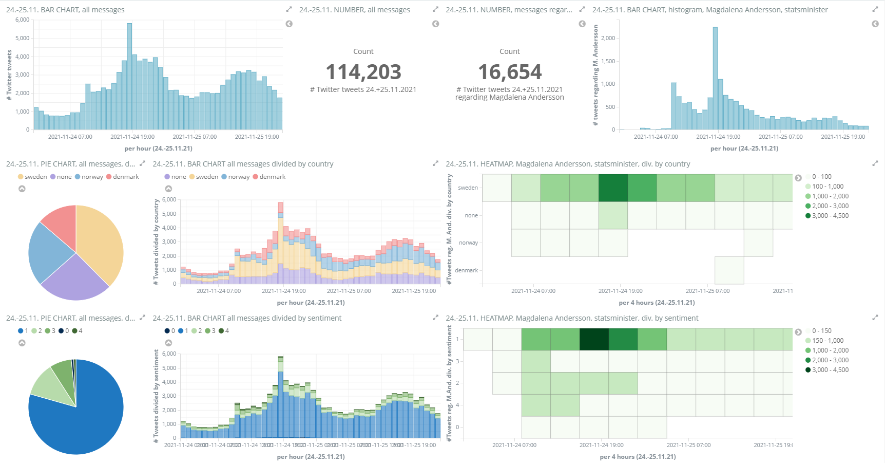
The task was to create a live dashboard displaying information about tweets regarding a special event in the news. We used the tool Kibana which was connected to the ElasticSearch database on the same server. I chose to focus on the situation during the change in prime ministers in Sweden in november 2021 and visualized tweets from 24. to 25.11.21. The live dashboard showed
- a comparison of all the tweets and the tweets regarding this topic (bar charts and counts).
- the precentage of messages that concerns each of the three countries (pie chart and bar chart).
- the count of messages regarding this topic for each country (heat map).
- the sentiments of all the tweets (pie chart and bar chart).
- the sentiments of the tweets regarding this topic (heat map).
- The sentiments are rated from 0 to 4, from unhappy to happy.