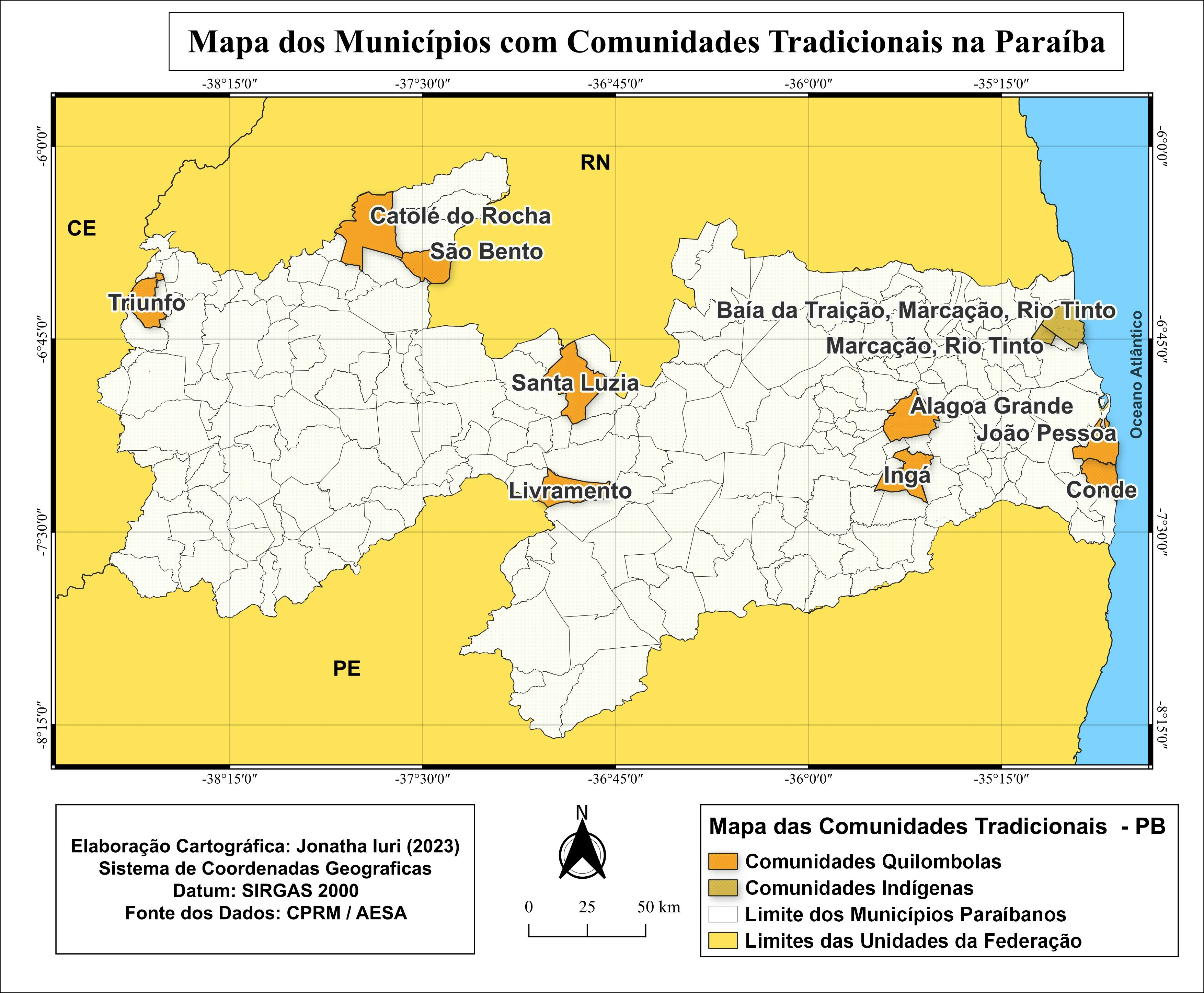
MAP TITLE: Population Density of Georgia by State and County Enumeration.
This map shows how the population of Georgia is spread out across the state. It uses dot density, where each dot represents 20,000 people. The left map shows population by state level, and the right map shows population by county level.
The story this map tells is that population is not evenly spread across Georgia. Some areas have many dots, meaning many people live there. Other areas have very few dots, meaning the population is low. Viewers can easily see that the biggest cluster of dots is around the Atlanta area, showing it is the most populated part of the state.
By comparing the two maps, viewers learn that different map scales and boundaries can change how we understand population patterns. The state‑level map gives a general idea, while the county‑level map shows more detail.
This map demonstrates how GIS can help people understand where people live and how population is distributed. It shows that cartography is a powerful tool for communicating information clearly and visually.